Trust is the best currency
Currently in Colombia, cryptofinance is still largely unknown to ordinary citizens. Lack of information creates a strong barrier to entry, causing many people to miss out on the opportunities they could benefit from by being part of the decentralised economy.
In this context, Bancolombia had an idea: to create a platform that would become the reliable bridge between traditional finance and the world of digital assets for that large sector of the public that does not know about it. And that is how Wenia was born.
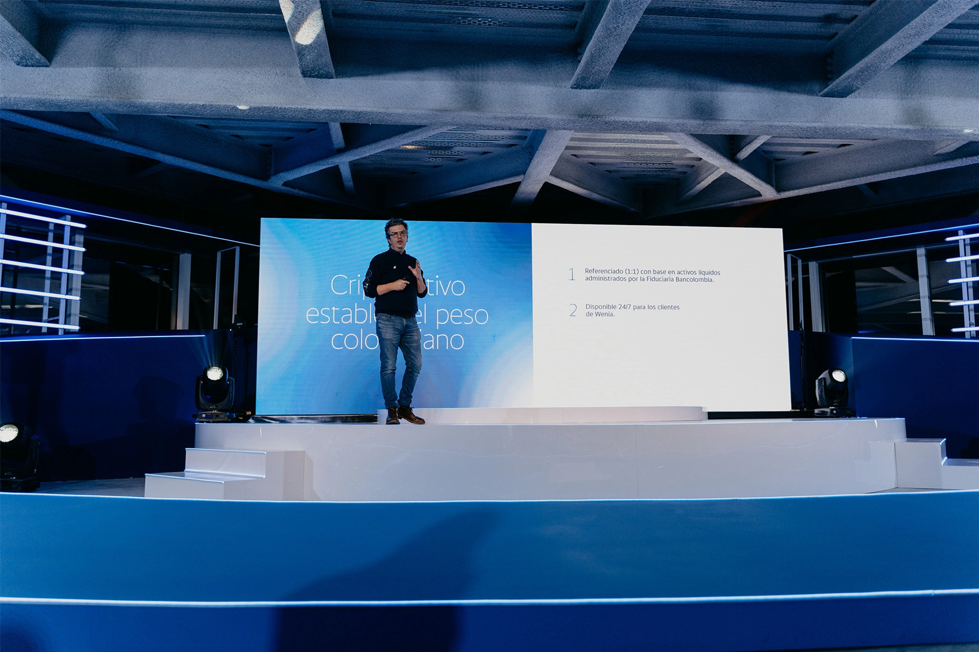
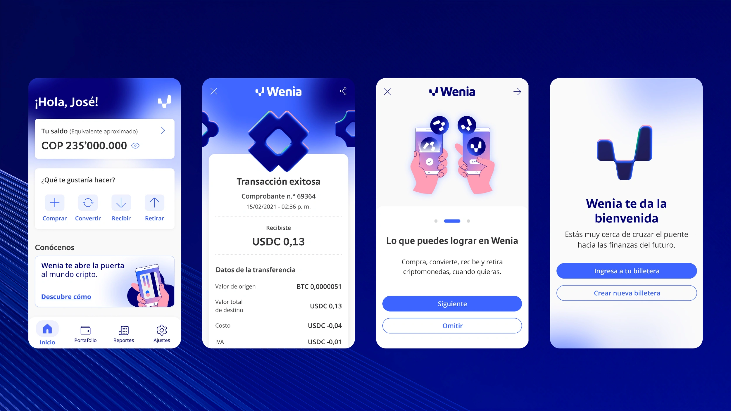
Wenia is an application that offers the possibility to buy, sell, receive, send and convert digital assets easily and securely. The highlight of its proposal is the introduction of COPW, a stable cryptocurrency backed 1:1 by the Colombian peso, providing stability and confidence to users in a market known for its volatility.
Such an innovative product needed to be presented to the audience in a friendly and approachable way, inviting everyone to trust and feel comfortable in a terrain yet to be explored. And with that in mind, we created the identity of Wenia.

Versatility
and adaptability
The isotype had to demonstrate the flexibility and adaptability of the new brand. To do so, we reinterpreted the shape of the W based on three irregular and asymmetrical modules that maintain a curved continuity, turning this element into an emblem of innovation and proximity.
In the logotype we combined this element with the typography made to measure for Grupo Bancolombia, with the aim of giving Wenia a greater link to the family.


The colours of modern mining
Wenia's main colours are Sapphire Blue, which evokes a digital environment and gives the brand a fresh and innovative character, Azurite Blue, which gives life and dynamism to the system, Nickel Grey, which helps the elements and the brand to breathe, and White, which brings clarity in communication. As complementary colours, we have Emerald Green, Copper Orange and Quartz Pink.
It is worth noting that all the colours in the Wenia palette are named after minerals and gemstones, to pay homage to the new way of mining that blockchain has developed.
A universe of its own
for the cryptoassets of tomorrow
In addition to the isotype and the logotype, we created a whole iconographic system so that Wenia would have its own visual language. All the icons are solid and with rounded corners, thus reinforcing the idea of closeness that the brand represents. Within the collection of icons, the cryptocurrency series stands out in particular.
Wenia also has a bank of illustrations, both in 2D and 3D, so that the brand can accompany its communications with visual supports that help users to understand the concepts more easily.
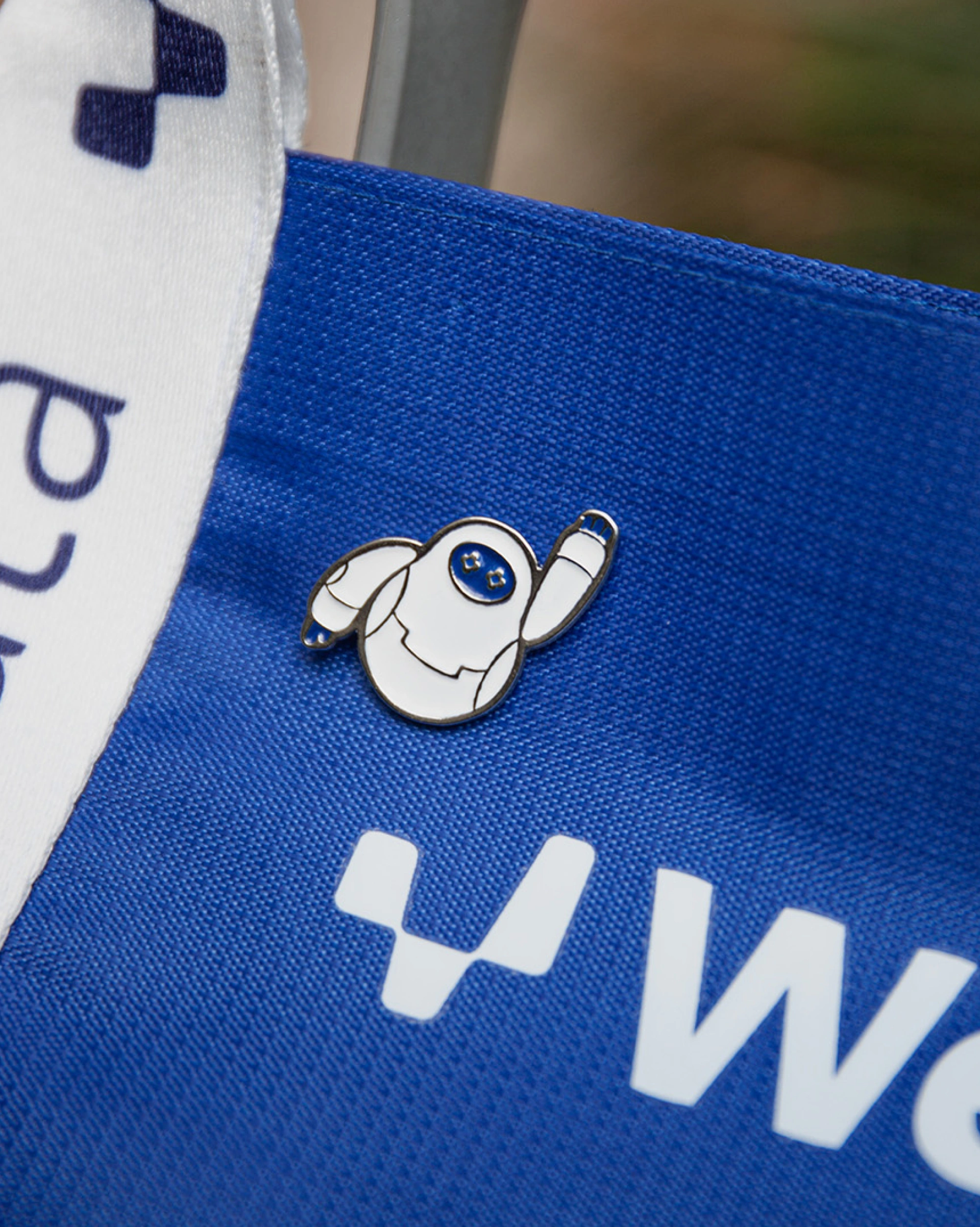
Although without a doubt, the brand assets that stand out the most are the characters. With the aim of approaching our public in a friendlier way, we created a girl, a boy and a small robot that we christened Laura, Guillermo and Wen, to accompany users in their transition to the digital assets of tomorrow.
And not only did we give them an image and a name, but we also determined the personality of each of them and gave them different responsibilities. Wen, for example, is the image of the support chatbot.
A bridge accessible to the entire crypto world
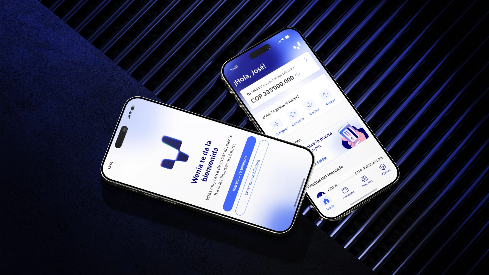
The branding proposal was also adapted for the app, where the use of colors, icons and character illustrations were essential to generate a connection with the user, and make their experience intuitive and accessible.
It's time to connect with the crypto side of things
In addition to the visual identity, we were also in charge of developing the brand's launch campaign. For this, we created a brand video manifesto, focused on its main value proposition: trust is the best currency.
We also developed a digital campaign under the concept ‘Connect with the crypto side. Join Wenia", which visually uses the resource of gradients between Sapphire Blue and White, complemented with emerging photographic elements and animated illustrations, to present the brand in a dynamic, agile and very casual way.
A promising launch
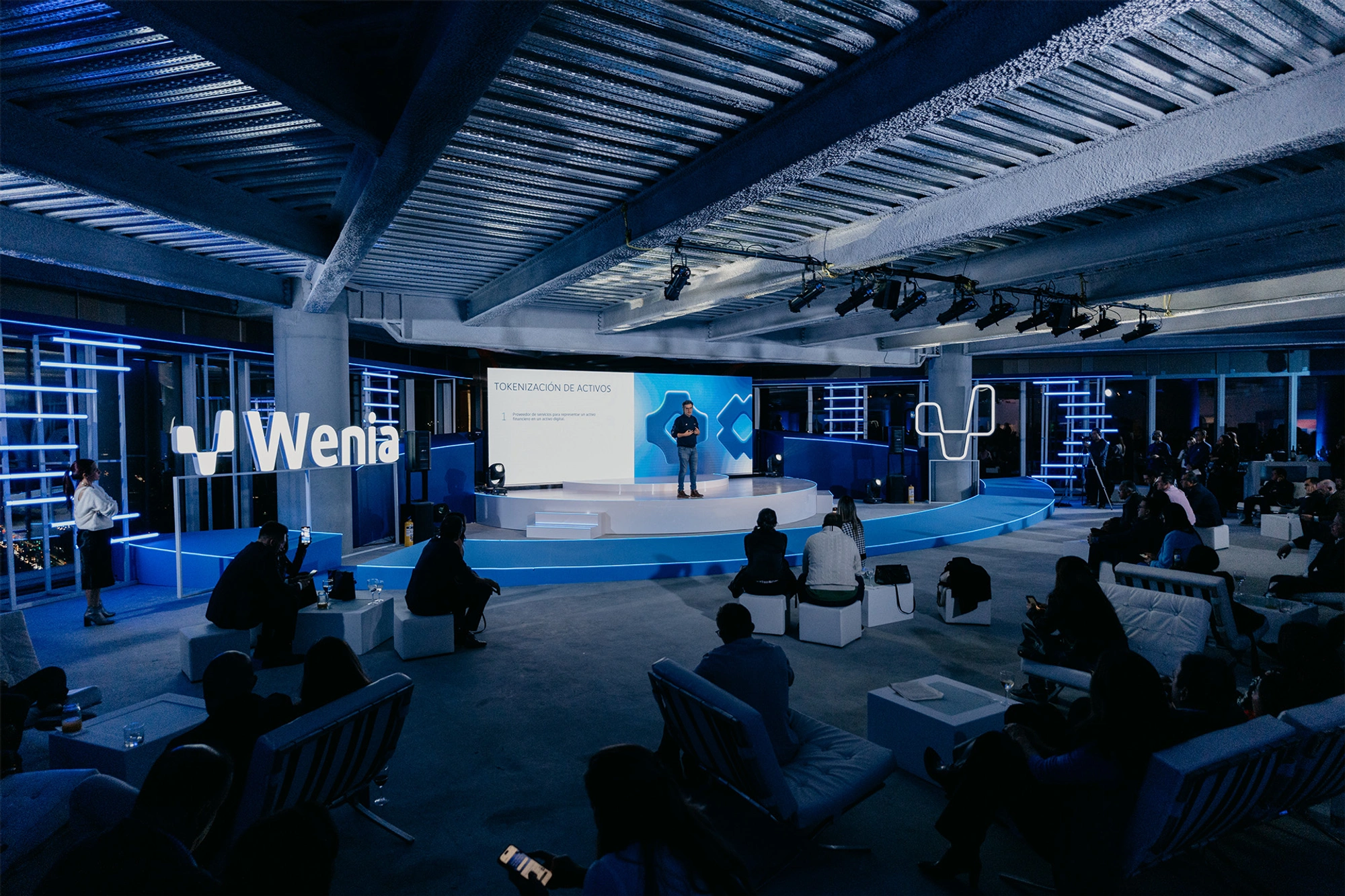
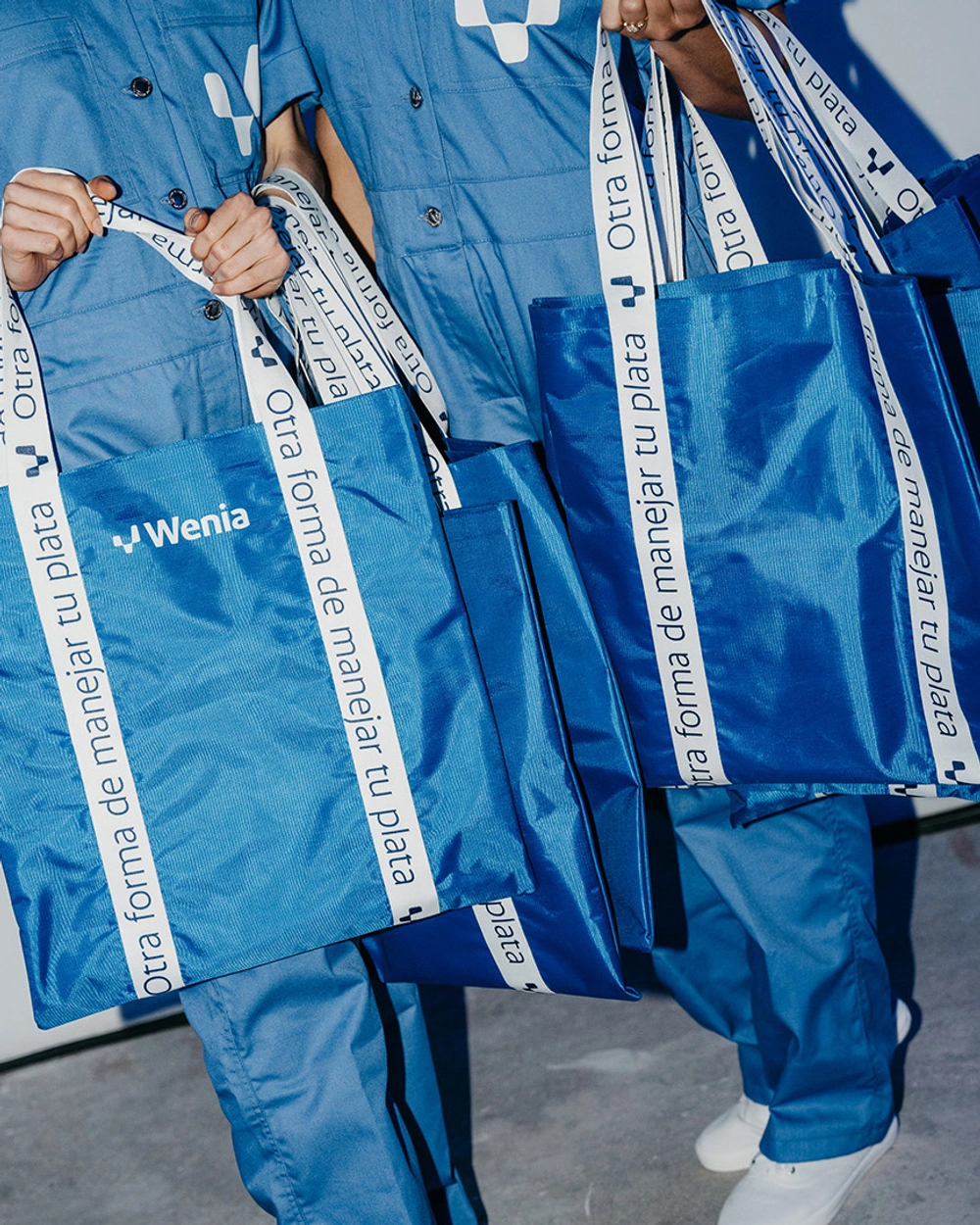
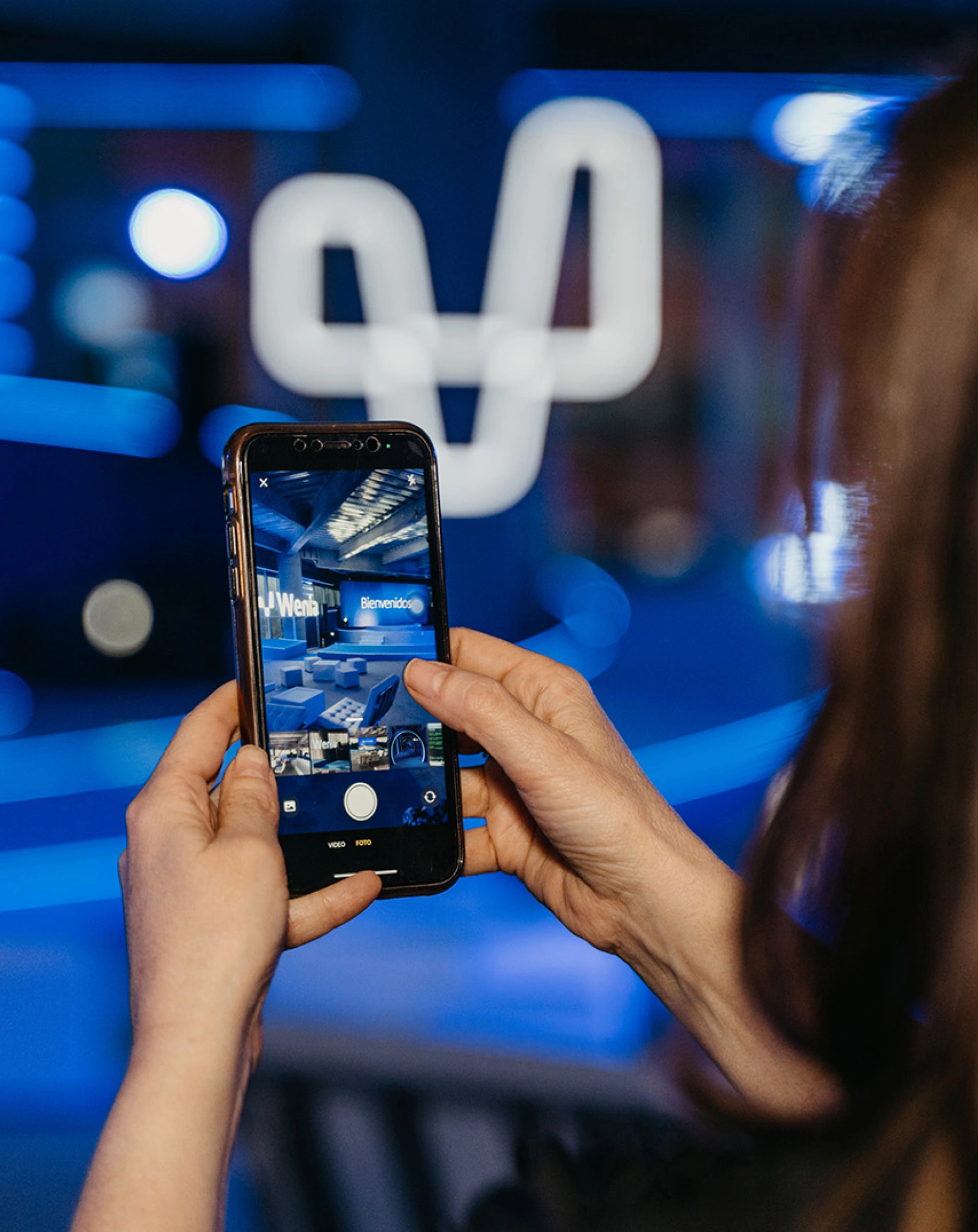
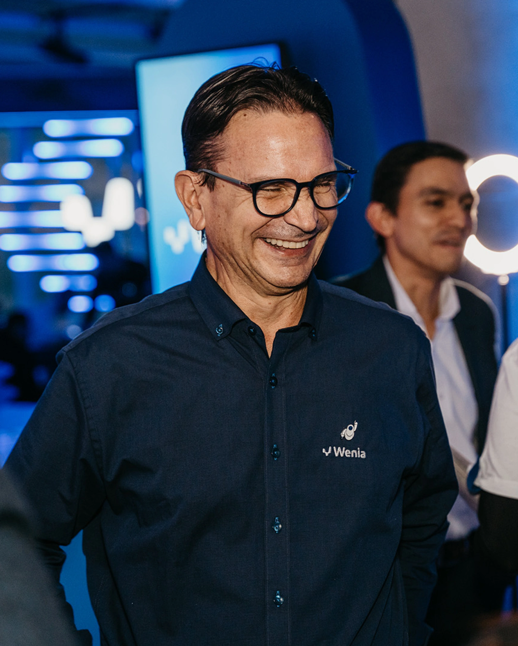
Finally, we were in charge of creating all the assets that were part of Wenia's launch event for the press and other VIP guests. We wanted to give the experience an innovative character. Therefore, we designed the tour through the space through elements such as blue lights, walkways with animated messages on LED screens and the white neon of the Wenia isotype, to generate the feeling in the attendees that they were really crossing the bridge that connects the silver of today with the digital assets of tomorrow.
Since its launch on 2 May 2024, a lot of conversations and impressions have been generated in digital media, demonstrating the great reception Wenia has received from the public. And the best part is that this is just the beginning of a long road for the Colombian economy of tomorrow.
