Flax+Kale is a food-tech brand founded in 2014 that promotes a lifestyle focused on respecting the environment, the people and our own health.
They are pioneers of the flexitarian diet, which is 80% plant-based but leaves that 20% wiggle room for the small pleasures of ethically sourced animal protein.
As they grew from a single restaurant to having multiple locations, a delivery service, plant-based foods and ready meals for retail and eventually even their own grocery stores it came time for a refresh.
This is when Flax+Kale came to us to get a new brand identity that was capable of keeping all of these new ventures working in sync.
The biggest obstacle to overcome was creating a system that shares the same language but is able to work several business vertical with very different customers, competitors and contexts.
It had to be something solid and recognizable, but with unique expressions that were always based on the core of what makes Flax+Kale unique: Being flexible.
If verbal language shared the same look and feel then it could act as the unifying beat across the many brands under the Flax+Kale umbrella, and that's how Paradis was born.
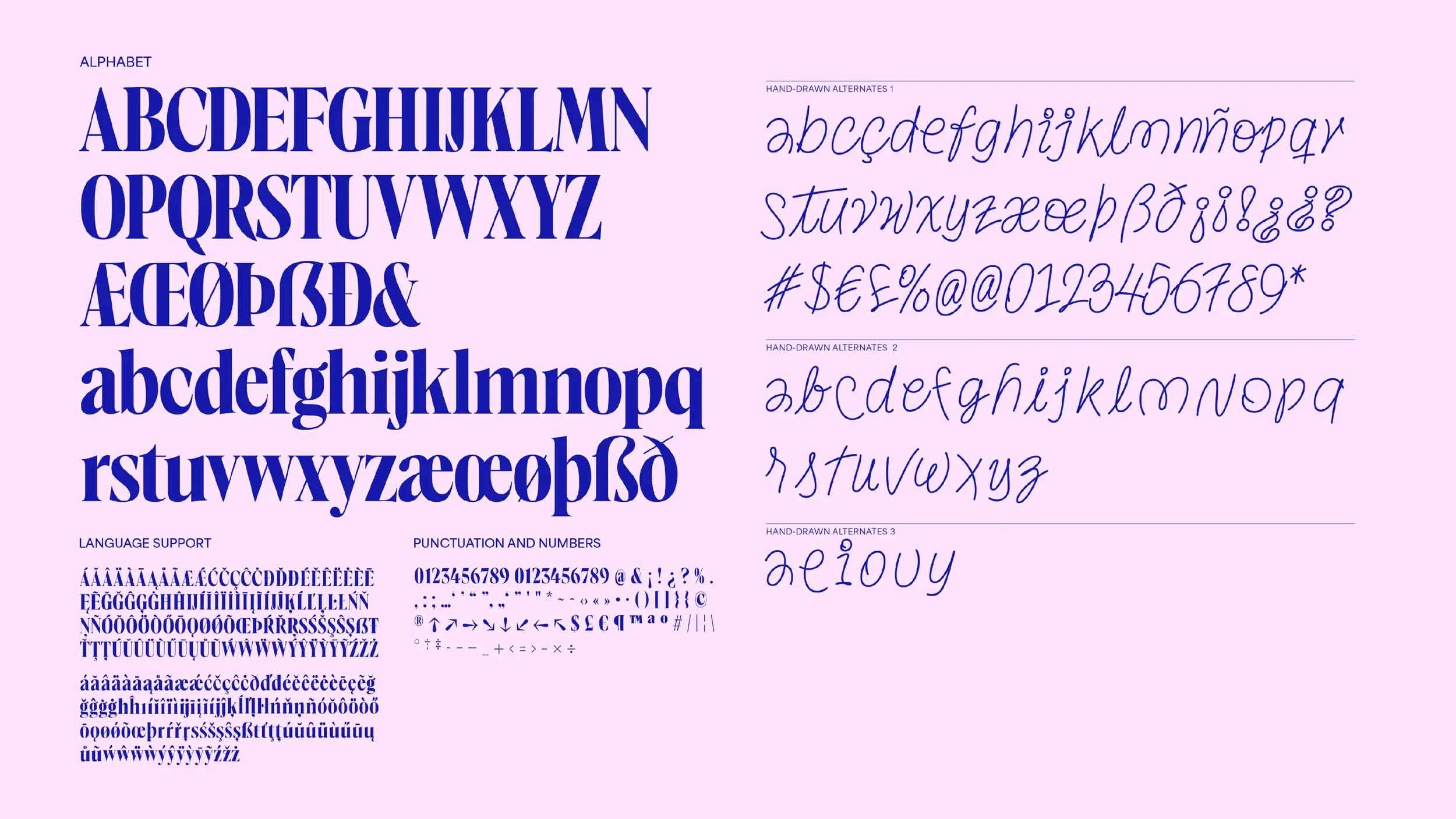
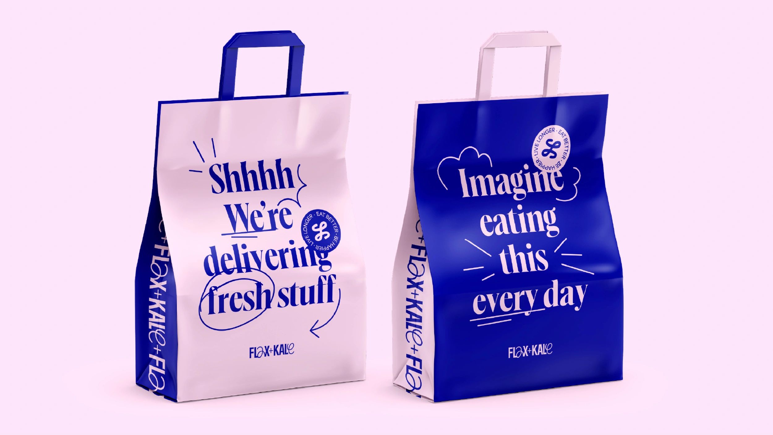
** Paradis is the official corporate typeface of Flax+Kale. We made it for creating striking headlines and titles, so it’s meant to be used BIG!**
The typographic forms have delicate and sharp details that make it elegant, while the compact in proportions and tight spacing make it possible to squeeze in a lot of text in tight spaces like social media or packaging.
This was a good start, but we still had to figure out a way to add flexibility to something as rigid as type.
Conozcan a Flexi, el elemento expresivo que dinamiza la personalidad de marca de Flax+Kale, aportando frescura y vitalidad. Una línea en movimiento que es la materialización de lo que es ser flexible.
Es un trazo gestual que convive con la tipografía y se hace visible en el logotipo y en la comunicación, adoptando una forma y un comportamiento diferente para cada una de las verticales de negocio de Flax+Kale: Para la marca maestra se convierte en letras, en hostelería en iconos y para el delivery en líneas de acción.

What makes Paradis special is how it combines typographic forms with handwritten ones, this way we can make even the verbal communication of F+K carry that flexibility DNA.
** Of course, the identity would not be very flexible if every time one wanted to add Flexi to the text they had to do it by hand, but thanks to the magic of OpenType we baked the Flexi Letters into the font itself.**
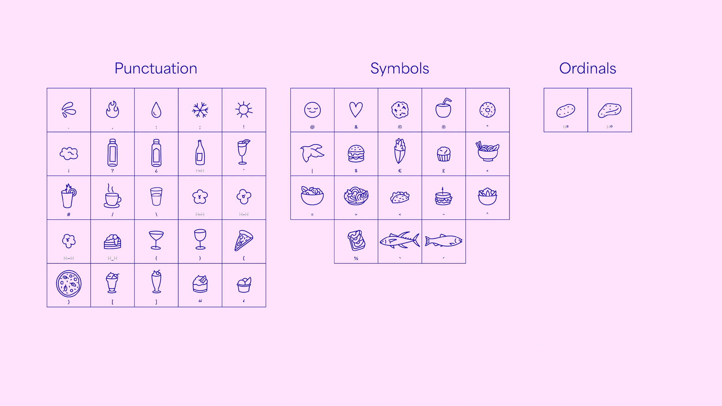
For every lower case letter we included at least two extra flexi designs that Flax+Kale can use to add a bit of spice to a word or a headline, there are even alternate designs for every number and most of the symbols, all very easy to access through any professional design app.
Like all the fonts we make here at Vasava, Paradis speaks over 200 languages so it will be ready for any expansion plans our client might have.
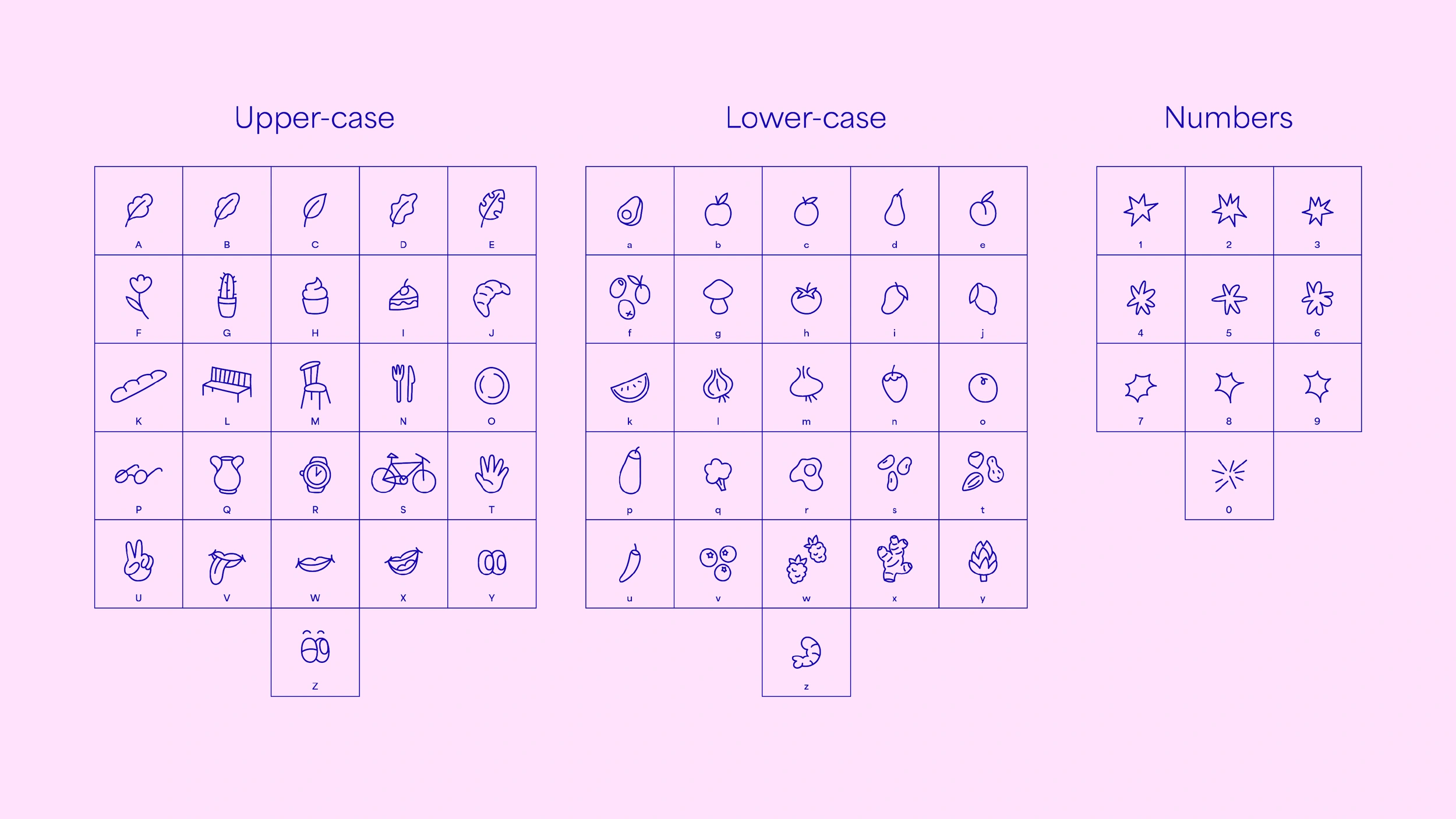
Paradis Icons has over 100 unique icons showing different ingredients, dishes, objects, actions and more, adding a visual layer to the text communication of Flax+Kale's hospitality business that makes it lively and differentiates from the masterbrand and delivery businesses.
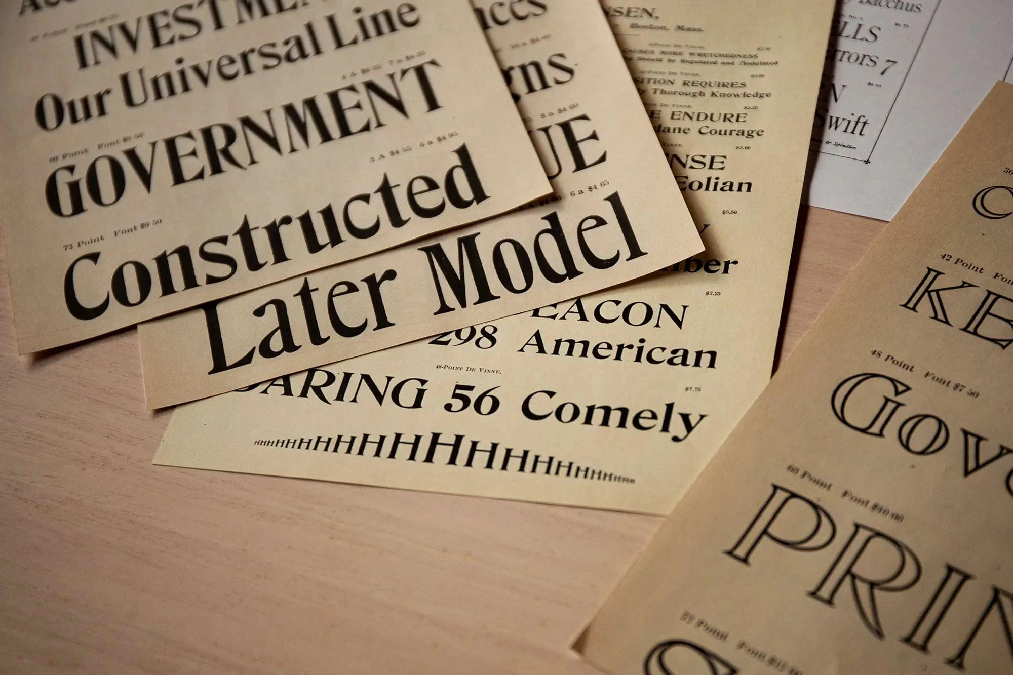
We drew Paradis after looking at multiple historical sources from the XIXth and XXth centuries, but by including the Flexi Letters and Icons we made sure that going forward Flax+Kale's communication would look modern, elegant and—most importantly—flexible.
