
Greatness redefined
Since its inception in 2001, originally known as the UEFA Women’s Cup and the first continental women’s football competition, the UEFA Women’s Champions League has been the stage where the sport’s elite come together to compete for the most coveted trophy of all.
As audiences increasingly recognise the extraordinary talent on display in every match, filling stadiums and attracting millions of viewers worldwide, UEFA identified the need for a renewed brand identity that could reflect the prestige, intensity, and excellence of the competition.
Following this strategic direction, Vasava was selected to develop a new identity system on UEFA’s behalf, designed to work with clarity, flexibility, and consistency across every touchpoint: stadiums, live broadcasts, digital platforms, merchandising, co-branding, and more.
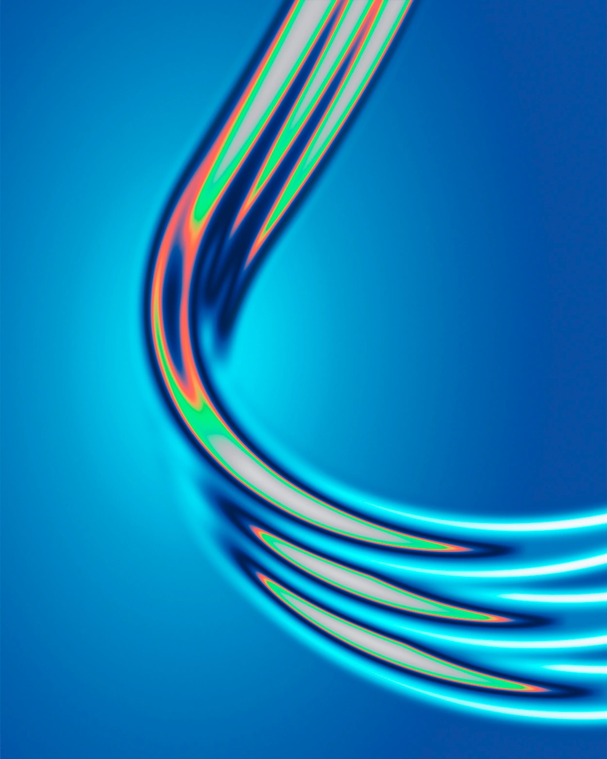
There are certain qualities some players possess that cannot be measured by statistics, data, or match figures. They are impossible to quantify yet unmistakably visible, expressed in the unexpected, the unforgettable, the extraordinary. That’s the essence of aura.
And in this competition, where the very best compete to be the best of the best, the aura shines stronger than anywhere else.
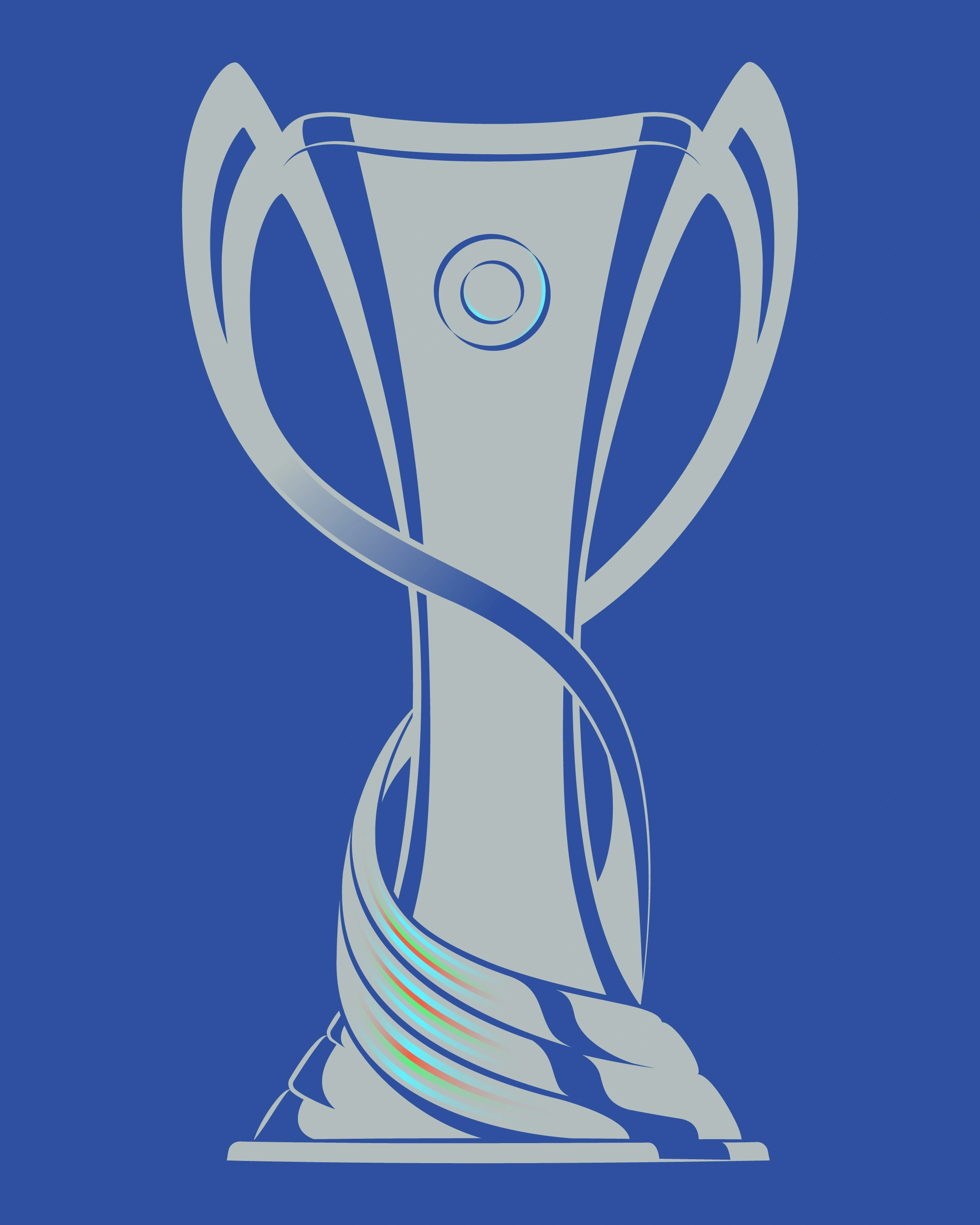
This is why we developed “Aura”, the central brand element of the UEFA Women’s Champions League identity. Inspired by the trophy’s handles, it symbolizes connection to the cup and the competition itself. Elegant, dynamic, and full of energy, Aura embodies the essence of the tournament.
From Aura emerges the ultimate expression: the Star Ring, a fresh visualization of UEFA’s most iconic brand element. Formed by the familiar stars arranged in a ring, it ties directly to UEFA’s core branding while giving the Women’s Champions League its own distinctive look and feel.

Building on these elements, the new identity included titles, animations, broadcast graphics, textures, and of course, the trophy itself.
It also had to reflect a major shift in the competition format, moving from a group stage to a league stage in which all teams are ranked on a single table to qualify for the next round.


A font with aura
Beyond visuals, a bespoke brand typeface was created for the Women’s Champions League: Champions Serif.
This font gives the competition a distinctive voice, setting it apart from its men’s counterpart, which uses a sans serif typeface, while still remaining firmly within the UEFA Champions League brand universe.
Champions Serif was designed to be elegant yet strong, traditional yet modern in functionality. Highly versatile, it adapts seamlessly to all communication, marketing, merchandising, and broadcast materials. An expressive variation, Champions Serif Display, italic-only, was also developed for contexts requiring stronger contrast and impact.


We crafted an identity without limits, a bold expression of a competition that never stops reaching higher, growing in quality, intensity, and global impact, with no ceiling in sight.