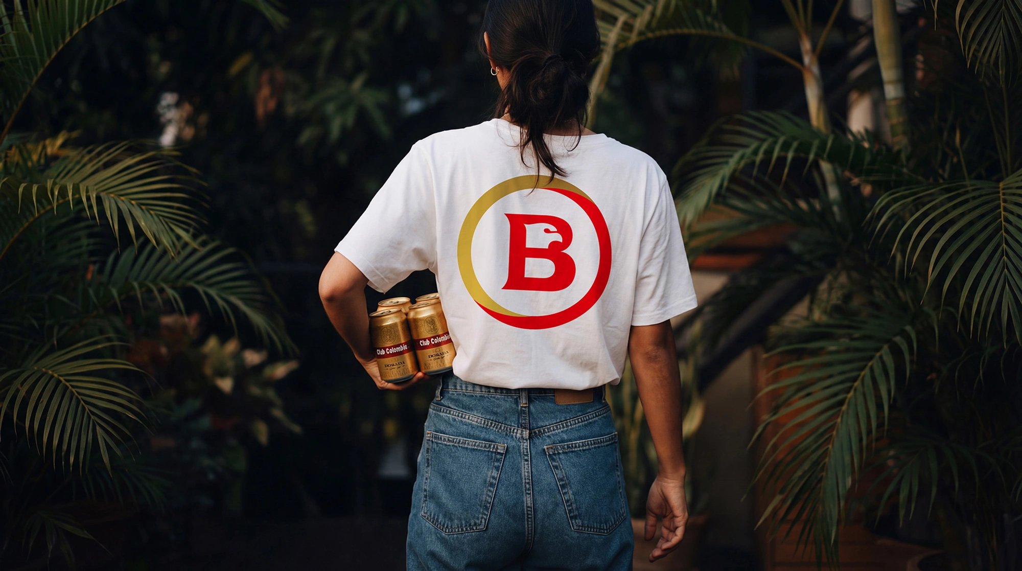
For a great moment
Bavaria is the largest beverage company in Colombia, with more than 135 years of history and specialized in the production and distribution of beer.
Together with Comuniza, Vasava developed its new identity, responding to an evolution of the brand toward a more active and relevant role in the lives of Colombians.
More than an aesthetic redesign, it is an update to the brand’s graphic system, aimed at generating stronger emotional connection, greater clarity and visibility, a solid narrative across commercial channels, and reinforcing Bavaria’s leadership.
The concept “Moments to toast” was developed not simply as a claim, but as a territory where the brand lives, understanding the toast as a universal act that transcends regions, contexts, and ages, as well as all types of gatherings, from large celebrations to small meetings. It is in those moments where Bavaria lives, not seeking to appropriate them, but to make them possible.
The structure of a toast
The circle is the core of the visual system, representing gathering, community, a shared ritual, and constant movement. It’s not just a decorative element, but the conceptual container of the toast and of the brand territory.
Within the system, it can act as a visual frame for moments, a focal element, or even as a modular system adaptable to multiple formats.
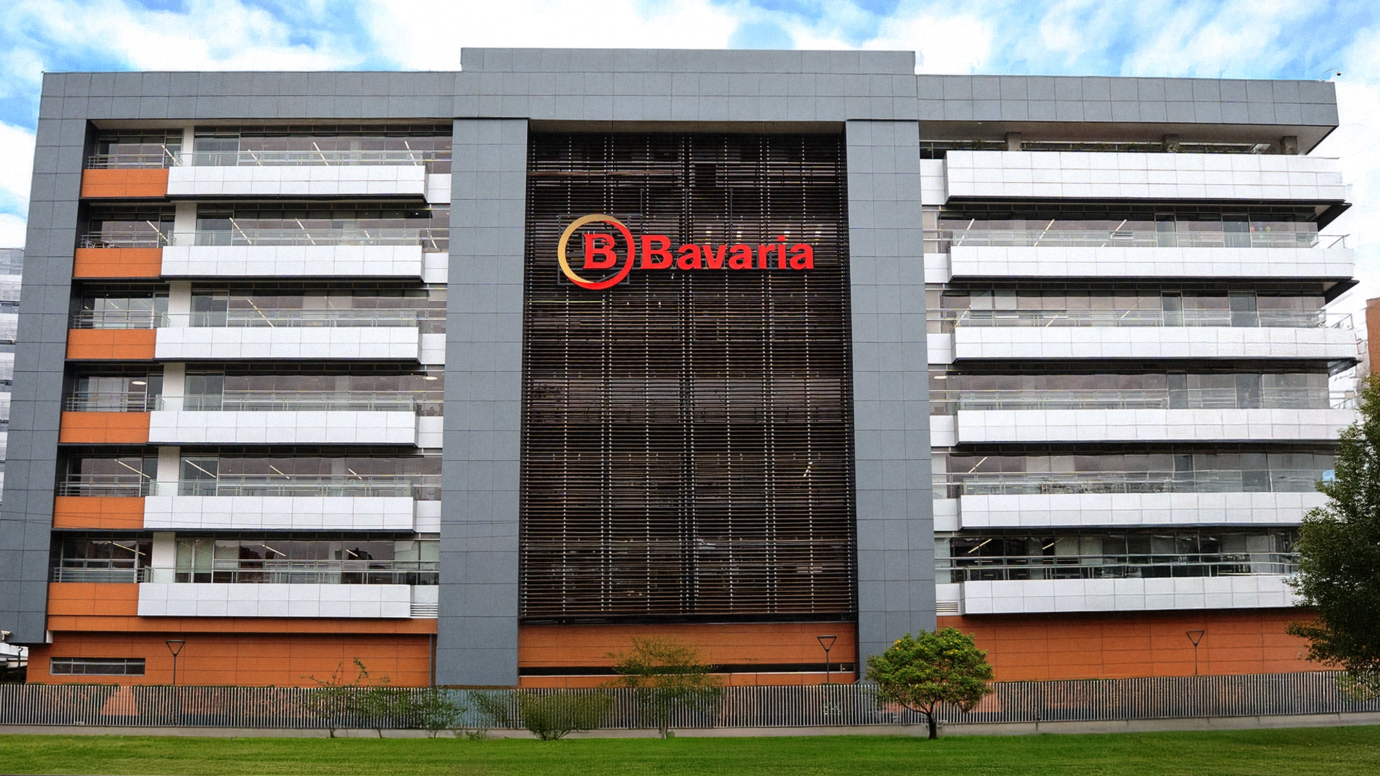
A symbol evolves
The eagle is one of the brand’s most powerful and recognizable assets. In the redesign process, the eagle evolved from a more illustrative logic toward a more iconic, synthetic, and functional interpretation.
This allows it to integrate naturally within the circular system as well as in digital contexts, and to better dialogue with the rest of the graphic elements.
Gold was incorporated into the color palette as a conceptual and strategic decision that connects the brand with its beer portfolio, linking leadership and institutional backing with quality and brewing mastery within a single visual code. A shift was also made toward a more legible and impactful typeface, responding to the needs of a more contemporary, solid, and functional voice.
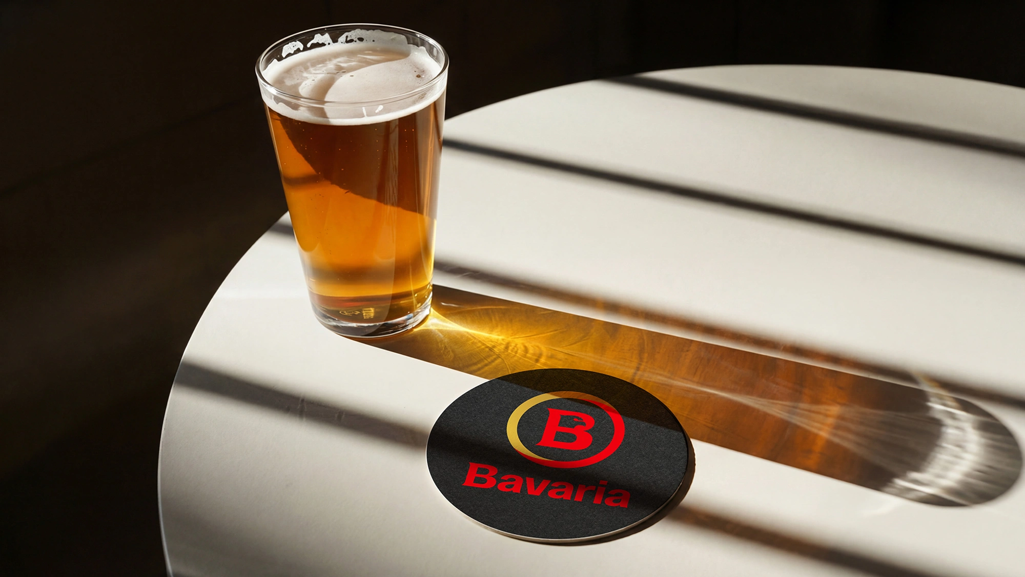
The update is ready
Drawing from the analogy between this process and a software update, the agency David developed the communication campaign,
understanding the update as a process that improves without erasing the past, preserving what is essential in order to optimize everything else and prepare the ground for what’s to come.
The circle as a central symbol is ideal for this analogy, mimicking the icon of a digital update or a data loading process. This campaign expands the meanings of the redesign into territories of innovation, technology, and connection with new generations.

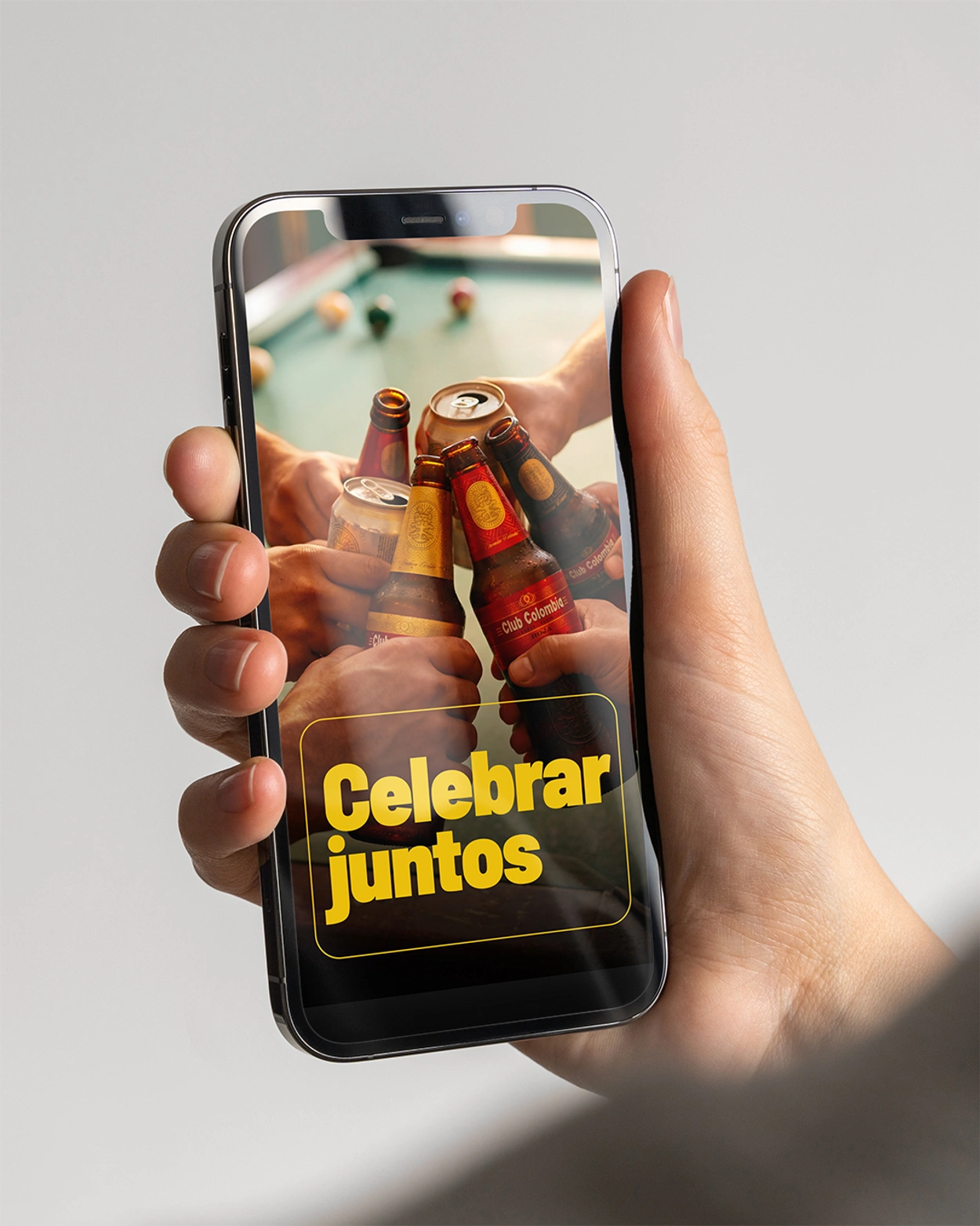
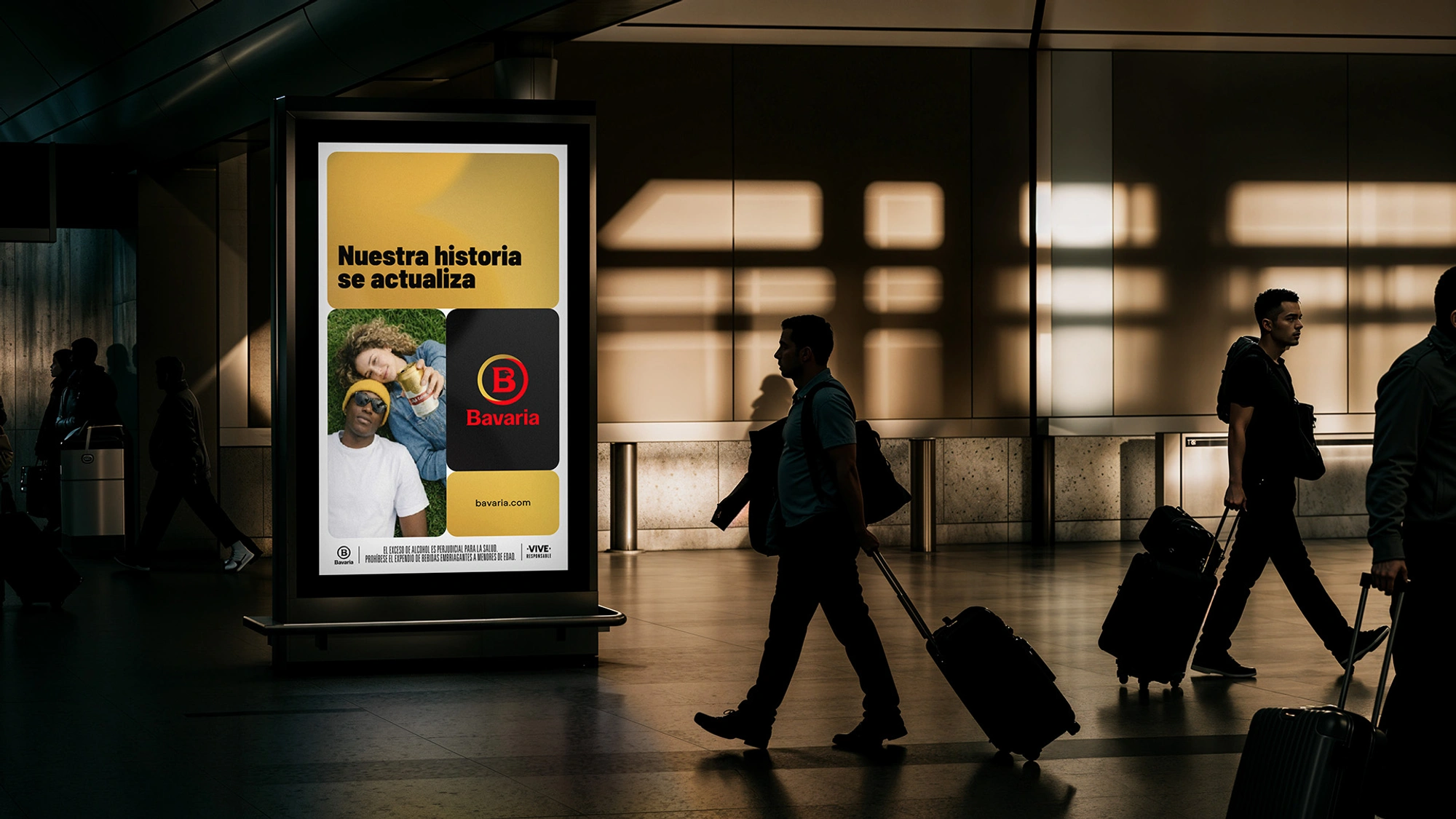
Bavaria is a brand that does not change its essence, but updates itself to keep bringing together, celebrating, and connecting all Colombians.